
DimDateReporting period
Power BI Solutions
Build the model and drill-through around the decision in the meeting.
For reporting, finance, operations and assurance teams whose Power BI reports need clearer measures, useful record-level drill-through and a maintainable refresh process.
Quanta Meridian connects a management question to a shared Power BI model that holds relationships and measures, then checks the result against the records used to calculate it.
When the report needs attention
A finished canvas can still hide an unreliable measure.
Finance and Operations may publish different on-time-delivery percentages even when both reports look polished. One may use dispatch date, another final receipt date, and a third may exclude reopened or cancelled orders.
A useful Power BI review starts by naming the population, date rule and exclusions. The shared model then holds the relationships and measures so the report does not recreate the rule on each page.
The retained reconciliation project independently calculates the Power BI result and four other implementations. It explains each difference before recording the agreed change.
Semantic model
One model carries the question into every report page.
Dimensions filter a fact at a declared grain. Explicit measures let a reviewer move from quarterly movement to the control record and named action.
DimRiskRisk theme and rating
*FactAssessment
- Grain
- One control assessment and quarter
- Keys
- Date · Risk · Control · Owner
- Values
- Evidence result · action block · readiness
DimControlControl and objective
DimOwnerControl or action owner
Explicit DAX measures
- Controls ready
- High-risk not ready
- Open reviewer questions
- Actions blocking sign-off
Sign-offQuarterly readiness
Blocked controlsEvidence question or open action
Control detailAssessment, file and owner action
Review sequenceQuarter → blocked control → evidence or action → owner
ModelFact grain and one-to-many relationships
MeasurePopulation, date logic and filter context
ReportOverview, exception and detail sequence
OperateValidation, timing, access and refresh owner
Decision-led report design
Give each layer one job from management question to owner action.
The page hierarchy follows the review. Detail is available when it changes an explanation or follow-up, rather than appearing simply because the model contains it.
- Q
Question
Name the review decision and the audience before selecting a visual.
- M
Model
Declare the fact grain, dimensions, date logic and measures that answer it.
- R
Report
Arrange overview, exception and detail pages into a deliberate reading sequence.
- A
Action
Let the reviewer reach the affected record, explanation and named owner.
Power BI delivery method
Model, explain and check the report as one working system.
The build moves from the review question to a controlled release. A report is not ready because the visual canvas looks complete.
The work begins with the meeting decision. That determines whether the facts contain assessments, purchase events, ledger entries or monthly workforce snapshots and which dimensions must filter them.
Power Query or an upstream model prepares the records. Explicit DAX holds the approved population, period and scenario logic before pages move from the headline to exceptions and record detail.
Before release, every displayed total is recalculated from retained facts. Filters, cut-off dates and drill-through links are tested, representative interactions are timed and accessibility is reviewed.
The maintained Power BI build
The working model, report pages and evidence needed to maintain them.
The exact file and release process depend on the client environment. Every delivery should still connect the model, measure, page, validation and owner.
Model the question
Give the report a stable analytical structure before deciding how the pages should look.
The report handover retains PBIP or PBIX working file, fact and dimension model and date table and relationship design.
Build the review pages
Connect prepared data and explicit measures to focused pages and purposeful interactions.
The report handover retains Power Query and DAX documentation, overview, exception and detail pages and drill-through and tooltips where useful.
Assure and hand over
Retain the evidence needed to check the result, assess the experience and run the next release.
The report handover retains record reconciliation and validation, performance and accessibility review and refresh, release and ownership notes.
Native evidence standard
A report image is evidence of the page, not the whole build.
A native Power BI delivery should retain the editable file, model, queries, measures and checks behind the report. A promotional image or recreated web graphic does not prove those parts exist.
A complete native build leaves more than a screenshot
The editable PBIP or PBIX file should retain the semantic model, relationship view, Power Query transformations and explicit DAX measures, including their definitions and known limits.
Native page evidence is supported by transaction tie-outs, filter tests, retained exceptions and representative Performance Analyzer results. Refresh ownership and accessibility decisions remain part of the handover.
The project evidence below is labelled as a Power BI Desktop screenshot. Each project page states its own evidence boundary and does not offer the working report file as a public download.
Published measure evidence
One disputed measure traced across five reporting implementations.
The project below proves the DAX reference, recalculation and numerical bridge. It does not claim or offer a native Power BI report.
01
Exact percentage bridge
On-time Delivery Metric Reconciliation
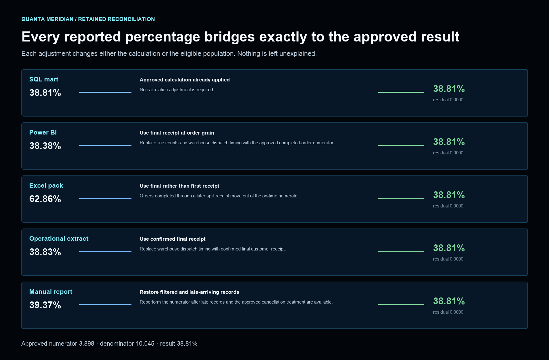
A row-level reconciliation explaining why the SQL reporting mart, Power BI model, Excel management pack, operational extract and manually maintained report show different on-time delivery percentages.
Calculation, event-date, record-grain and extract-population adjustments bring every reported version to the same numerator and denominator with no residual.Inspect this projectDesign and operating choices
Put each decision in the layer that can maintain it.
Power Query or upstream preparation
Use when
Transaction shaping is clear, proportionate and assigned to the layer best able to maintain it.
Boundary
Large, shared or historically complex transformations may belong in SQL or another governed data layer.
Semantic model
Use when
Reviewers need consistent facts, dimensions, time logic and reusable measures across report pages.
Boundary
A model cannot resolve disputed business definitions without an agreed owner and decision.
Report interactions
Use when
A filter, tooltip or drill-through helps a reviewer move from a headline to relevant context or records.
Boundary
Important conclusions must remain available without a precise pointer action or hidden interaction.
Release and ownership
Use when
The report needs defined development, review and release steps with named refresh responsibilities.
Boundary
Workspace, licensing, security and deployment choices depend on the client environment and are agreed separately.
Related capabilities
The report depends on modelling, preparation and review design.
Power BI
Power BI connects an agreed management question to a dimensional model, explicit measures and the records needed to explain the result.
See how it is used in projectsSQL
SQL gives invoice lines, orders, receipts and reference data a declared grain before they become shared reporting totals.
See how it is used in projectsExcel and Power Query
Excel and Power Query are used when people need a familiar workbook without hiding file intake, transformation logic, adjustments or checks.
See how it is used in projectsWhen Power BI is not the first fix
Resolve the disputed measure before adding another report.
Power BI is not the first fix when the underlying records, definitions or review responsibilities remain unresolved. A report is not described as live, production-ready or maintainable without evidence for its refresh, security and release process.
Bring one Power BI report, the decision it is meant to support and a short account of its records and refresh process. Confidential or protected data is not needed for the first conversation.
Discuss a Power BI reportReturn to all solutions